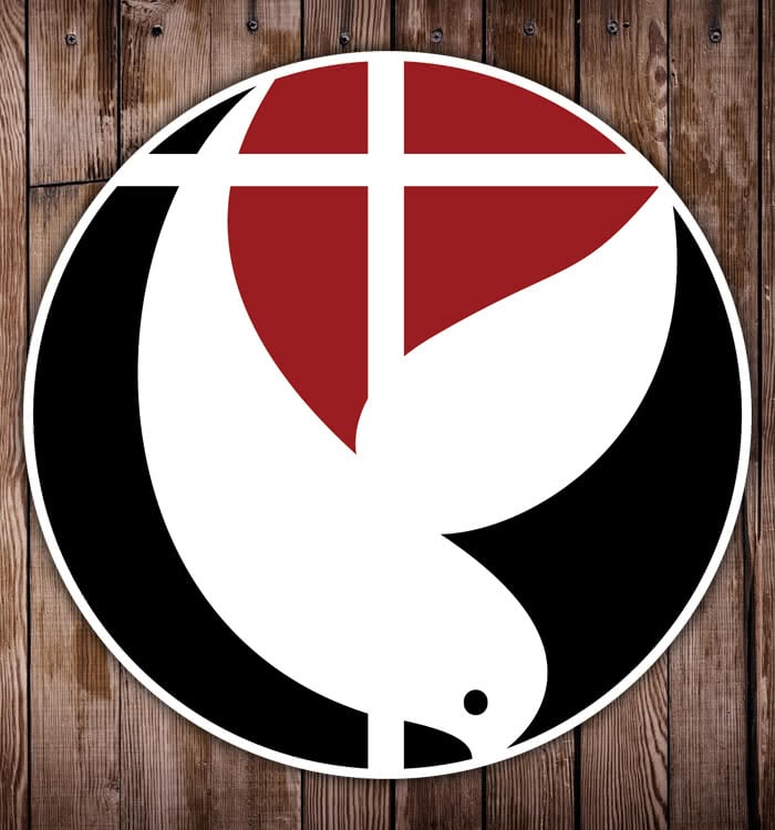
Project Goal
To modernize an aging logo without losing the overall identity.
Solution
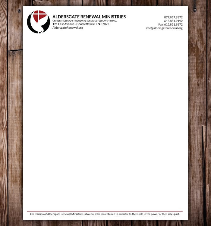
The client had several versions of their old logo, and no branding guidelines. Employees would pick any font they liked to go with the logo, and sometimes just change the logo colors if they felt like it. We created a fresh, rounded version of the logo without losing the look of the dove and chose a dark, red color as their standard color (except in one case where the logo is printed in purple). We also standardized their type design, settling on Lato and Klinic Slab. We helped them get out of the practice of choosing different fonts for every design and helped them unify their branding across all of their print and web materials. Once this was done, we redesigned several of their print pieces includingtheir letterhead and yearly newsletter. Overall, the client was very happy with the change and their constituents had no issue recognizing the new logo.
UPDATE: This client has since changed their logo to something completely new.
Related projects:
Aldersgate Renewal Ministries Website
Aldersgate Renewal Ministries Newsletter