
Project Goal
To update a series of brochures and unify the branding while keeping in line with their older printed materials
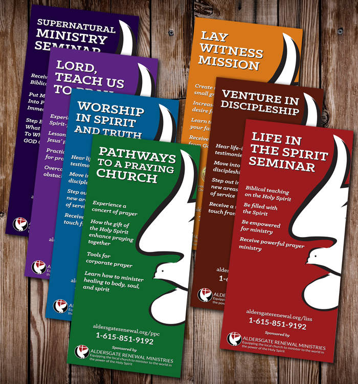
Solution
In order to make sure the new brochures still fit into their family of other printed items, we kept the original dove graphic, but removed any extra design elements and went with a solid, bold color for the front of each brochure. We also used their new branding fonts to bring them in line with other newer print pieces.
On the back and inside, we removed several large color tints and left the single large dove watermark, but adjuisted it so it wasn't distracting to the reader. We also chose new, but similar colors for each brochure that would make them stand out but still match closely with other printed materials. Lastly we reworked and rearranged some of the panels so that all the brochures had a uniform design. We moved similar content to the same location across all seven brochures so readers would have some familiarity across the entire set if they take more than one brochure.
Feedback on the new was very well received and the client was excited to place these with their table top display to show them off.