Case Study: Aldersgate 2015 Conference Materials
Project Goal
To take the 2015 conference materials to a new level in quality and make them more user friendly, especially to those new to the ministry.
Solution
Since the logo for the conference was set before we were brought on board, we had to work within the confines of the logo, such as it only really working well on a black background. We reworked the conference "header" to incorporate their ministry logo, and matched the type to the logo on their main ministry website.
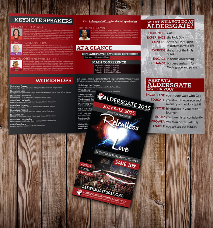
For the brochure, we took the framework of their 2014 brochure, but gave it a modern look, and then merged some content to streamline it and to give more breathing room in the content. Large blocks of alternating colors were used to break up the content and the fonts were matched to those used in their other new print materials (such as their new newsletter design that we created for them).
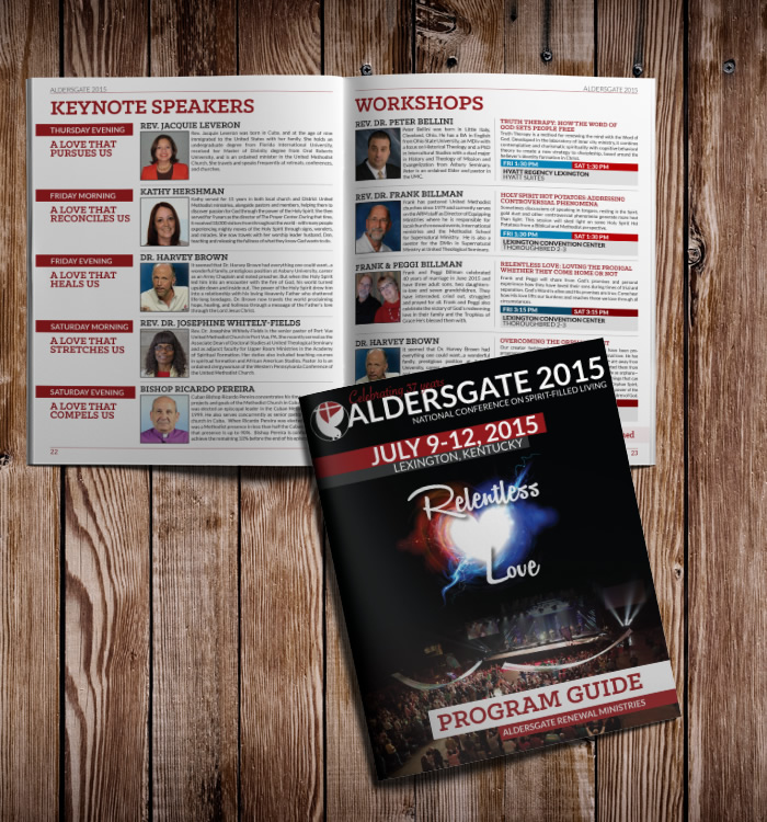
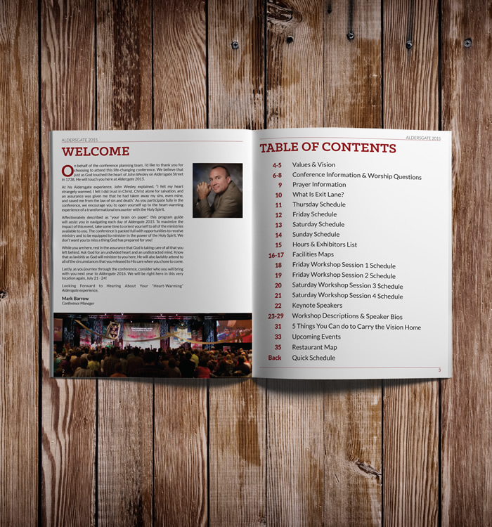
For the Program Guide, we used the content from the 2014 guide as a base, but started from scratch with the layout. The old design had very little white space, busy textures behind every page and lots of unneeded call to action elements such as star bursts and bright colored boxes. We streamlined the design, using white as the base instead of textured images. Photos from the 2014 conference were also added to make the guide feel a bit more personal and a bit less text heavy.
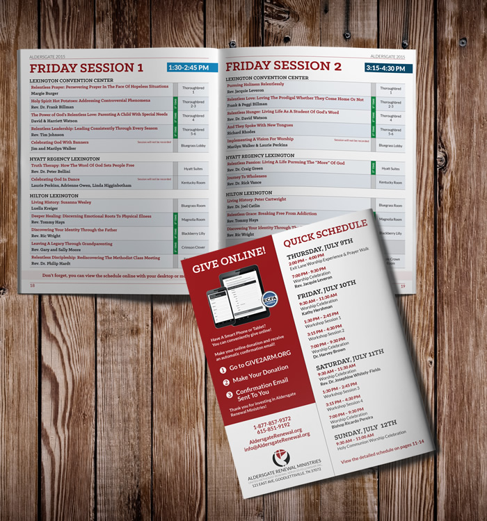
A new layout was created for the workshop grid and it was expanded from 2 pages to 4 pages to make it easier to read. Careful attention was paid to every aspect of the book and if something could be streamlined, shortened or reworked to make it clearer, this was done. The size of the guide was changed from 8.5"x11" to 8"x10" to give the book a slightly different feel from a magazine.
Feedback on the new layout was very good, and conference attendees commented on how easy it was to find everything in this new format.


